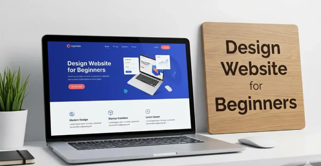
Design Website for Beginners: The Complete Beginner’s Handbook
Design Website for Beginners
Most websites lose visitors before the first scroll because the brain decides trust in seconds. That is why Design Website for Beginners is not about making pages look attractive. It is about controlling attention through Visual Hierarchy, understanding Reading Psychology, and reducing the Conversion Gap between clicks and actions.
Professional designers build layouts around behavior, not personal taste. The difference between a website that gets ignored and one that converts often comes down to structure, spacing, clarity, and User Intent. This guide breaks down the exact principles behind Design Website for Beginners so you can create websites that feel credible, persuasive, and easy to navigate from the first interaction confidently.
How the Human Brain Actually Reads a Web Page
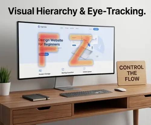
Most beginners assume users read websites line by line. They do not. Eye-tracking studies show people scan pages using the F-Pattern on content-heavy layouts and the Z-pattern on landing pages with minimal text. Strong Visual Hierarchy controls where attention moves first through size, contrast, spacing, and positioning. Headlines should dominate visually, while supporting content guides the eye toward a clear Call to Action (CTA). Reading psychology also depends on cognitive load. Crowded layouts force users to think harder, reducing retention and trust. Smart designers reduce friction by grouping related content, using predictable layouts, and creating scanning paths that feel effortless on both desktop and Mobile-first experiences.
Building Your Layout Like an Architect, Not an Artist
Great websites are structured systems, not random creative experiments. Professional layouts rely on grid systems that create consistency, alignment, and visual rhythm across every section. A clean structure improves readability and strengthens Visual Hierarchy without overwhelming users. Effective White Space acts like breathing room between elements, making content easier to scan and reducing mental fatigue. Beginners often try filling every empty area, which weakens focus and lowers perceived quality. Strong layouts also prioritize above-the-fold strategy by placing core messaging, benefits, and the primary Call to Action (CTA) immediately visible. Below the fold should deepen trust with proof, explanations, and supporting details that naturally guide visitors toward conversion.
Color Psychology: The Science Behind Every Design Decision
Color influences emotion before users read a single word. Blue often communicates trust, red creates urgency, and green suggests growth or stability. The 60-30-10 Rule helps beginners balance colors professionally by assigning sixty percent to a dominant color, thirty percent to a secondary tone, and ten percent to accent elements. This structure prevents chaotic interfaces and improves visual consistency. Poor color decisions damage credibility quickly, especially when contrast is weak or every section competes for attention. Strong color systems support Visual Hierarchy, highlight key actions, and reinforce brand identity. Designers should also test colors for Accessibility, ensuring buttons, text, and interactive elements remain readable across different devices and lighting conditions.
Typography That Communicates, Not Just Decorates
Strong Typography improves comprehension, trust, and user retention. Beginners often choose decorative fonts that look attractive but damage readability across devices. Effective websites separate heading, body, and accent styles with clear visual contrast. Headlines should capture attention immediately, while body text remains comfortable during long reading sessions. Font pairing works best when combining one expressive typeface with one neutral, highly readable option. Spacing matters equally. Proper line height, paragraph spacing, and letter spacing reduce cognitive strain and improve scanning behavior. Good Typography also strengthens Visual Hierarchy by guiding readers toward the most important content first. Consistency across headings, buttons, navigation, and forms creates a professional experience users subconsciously trust.
Designing for Real People, Not Imaginary Users
Design Website for Beginners
Beginner designers often create websites based on personal taste instead of user behavior. Effective design starts by identifying the target audience’s goals, frustrations, devices, and browsing habits. A website for business owners requires different messaging and layouts than one targeting gamers or students. Strong Accessibility practices ensure more users can navigate the website comfortably, including people with visual or motor limitations. This includes readable contrast, keyboard navigation, scalable text, and descriptive labels. Modern websites must also follow a Mobile-first approach because most visitors interact through smartphones before desktops. Smaller screens force designers to simplify navigation, prioritize content, and remove distractions. User-focused layouts consistently outperform visually impressive but confusing interfaces.
The Psychology of Trust Making Visitors Feel Safe Instantly

Visitors decide whether a website feels trustworthy within seconds. Poor spacing, outdated visuals, and inconsistent branding create immediate doubt, even when the business is legitimate. Strong trust signals include professional Typography, secure HTTPS indicators, recognizable logos, testimonials, client results, and realistic imagery. The placement of social proof matters. Reviews and credibility indicators should appear near high-friction decision points and close to the main Call to Action (CTA). Designers should also understand the fold of trust. The area users first see must clearly explain value, legitimacy, and purpose without confusion. Clean White Space, predictable navigation, and consistent design patterns reduce anxiety, helping users feel confident enough to continue exploring or making a purchase.
Watch Video: Don’t miss out! Check out my latest YouTube video for in-depth insights and exciting content. Click here to watch ByteScript MZA now!
Conversion vs Aesthetics: Designing Pages That Actually Work
Beautiful websites fail when they do not guide users toward action. Conversion-focused design prioritizes clarity over decoration. One page should support one primary goal, whether that means booking a service, downloading a guide, or completing a purchase. Beginners often create weak Call to Action (CTA) buttons by using vague text, poor contrast, or crowded placement. Small decisions matter. Button size, spacing, wording, and surrounding White Space directly influence clicks and engagement. Strong Visual Hierarchy ensures users instantly understand where to focus next. Designers should also reduce competing actions and unnecessary animations that distract from conversions. Effective websites balance aesthetics with behavioral psychology, making interactions feel obvious, frictionless, and rewarding for visitors.
Your Beginner Design Toolkit: Free Tools Professionals Use
Modern web design no longer requires expensive software. Figma remains one of the most valuable free tools for creating layouts, prototypes, and collaborative design systems directly in the browser. Beginners can use Figma to organize components, build responsive frames, and test user flows efficiently. Coolors helps designers generate balanced color palettes quickly, while Google Fonts provides highly readable web-safe Typography options. Browser DevTools allow users to inspect live websites, analyze spacing, and understand responsive behavior without coding expertise. AI design assistants can accelerate brainstorming, layout ideas, and content structuring, but they should support creativity rather than replace strategic thinking. Combining these tools creates a practical workflow for building modern, user-focused websites faster.
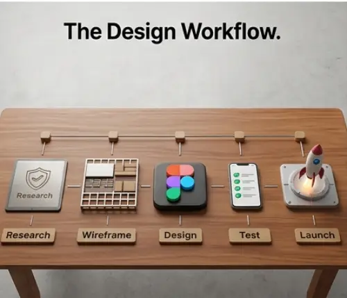
From Blank Canvas to Live Website: Your First Design Workflow
Professional websites follow a repeatable process instead of random inspiration. Start with research by analyzing competitors, user expectations, and industry standards. Next, create a simple Wireframe to structure layouts before focusing on colors or visuals. A Wireframe clarifies navigation, content hierarchy, and placement decisions without distractions. Mood boards help define visual direction through curated fonts, colors, interface references, and imagery styles. After approval, move into full design inside Figma, then test responsiveness using a Mobile-first mindset. Before launch, apply an MVDesign checklist covering Accessibility, loading speed, consistency, readability, and conversion flow. Structured workflows reduce mistakes, improve collaboration, and create websites that feel intentional instead of improvised.
Essential Resources for Creators:
- Need to test React code fast? See our top pick for the Best Online React Compiler 2026.
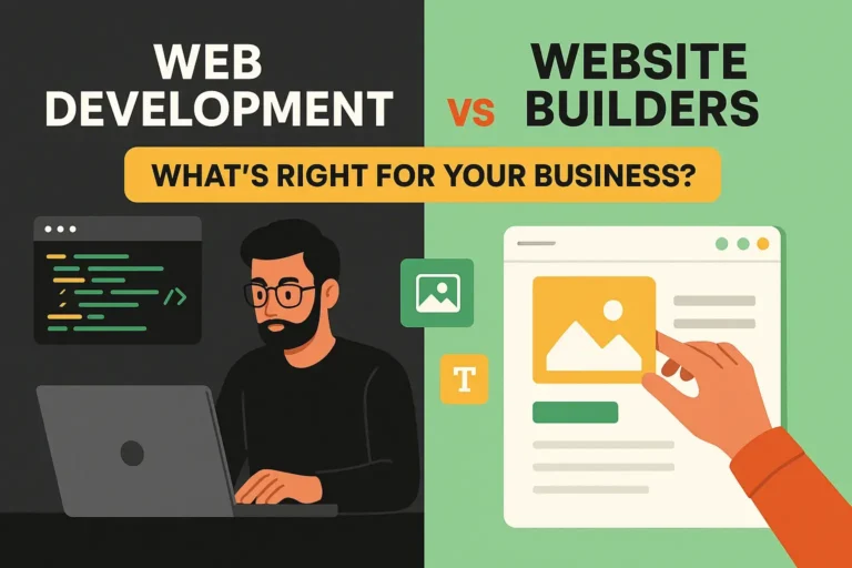
- Stuck between coding and no-code? Find your answer in Web Development vs Website Builders (2026 Guide).
- See these principles in action: Explore how I applied advanced engineering to build The Blueprint Respiro Premium Shopify.
The Beginner’s Roadmap: What to Learn Next
Web design mastery happens in phases. Beginners should first understand layout structure, Typography, color systems, and Visual Hierarchy before moving into advanced UI and UX principles. The next stage involves learning responsive design, Accessibility, interaction psychology, and Mobile-first optimization. Designers who also study front-end development gain a major advantage because they understand how real websites function technically. Building a portfolio does not require paying clients. Personal redesign projects, fictional brands, and case-study websites demonstrate problem-solving ability effectively. Every project should explain goals, decisions, and results rather than only showing screenshots. Consistent practice, design critique, and analyzing high-performing websites accelerate growth faster than endlessly consuming tutorials without applying the knowledge.