Dark Mode vs Light Mode UX: 7 Design Secrets for 2026
Dark Mode vs Light Mode UX
As a web developer, I’ve seen the Dark Mode vs Light Mode UX debate evolve from a simple “aesthetic choice” into a critical technical requirement. In 2026, users expect an interface that doesn’t just look good but adapts to their environment and device performance.
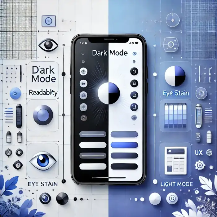
Whether you are building a high-speed portfolio or a content-heavy blog, the choice between these two modes impacts user retention, accessibility, and even device longevity. Let’s break down the data-driven reality of modern UI design.
Understanding Visual Polarity
In UX design, we categorize these modes based on “polarity”:
- Positive Polarity (Light Mode): Dark text on a light background. It mimics the classic reading experience and offers high legibility.
- Negative Polarity (Dark Mode): Light text on a dark background. It’s designed to reduce light emission and provide a modern, sleek feel.
Dark Mode vs Light Mode UX Comparison: 2026 Standards
| Feature | Light Mode | Dark Mode | Best for… |
| Daylight Readability | Excellent | Poor (Reflections) | Outdoor Use |
| Nighttime Comfort | Low | High | Low-Light Use |
| Battery (OLED/AMOLED) | High Drain | 30% – 60% Savings | Mobile Users |
| Reading Speed | Faster Scanning | Focused Reading | Research/Blogs |
| Eye Strain (Blue Light) | Higher | Lower | Long Sessions |
Why Dark Mode is a Technical Necessity in 2026
1. The Psychology of “Visual Fatigue.”
Most users now spend 8+ hours daily on screens. Dark Mode reduces the overall brightness and “blue light” intensity. From a developer’s perspective, implementing a dark theme is no longer optional—it’s a courtesy to the user’s eye health.
2. Hardware Optimization (The OLED Factor)
Modern smartphones and laptops use OLED/AMOLED screens where black pixels are physically turned off. This isn’t just a design trend; it’s a performance hack. Using Dark Mode can extend a mobile device’s battery life by up to 60%, making your site “eco-friendly” and efficient.
3. High-End Aesthetic and Focus
Dark Mode creates a sense of depth. For visual-heavy sites, a dark background makes colors and images “pop” without distraction. It’s the preferred choice for creative professionals and developers who need to focus for long periods.
Why Light Mode Still Holds the Crown for Legibility
1. Superior Contrast for Scanning
Human biology is wired to recognize dark shapes on a light background (think of ancient scrolls or newspapers). If your website requires users to scan large amounts of text, such as a documentation site or a news portal, Light Mode is still the undisputed king.
2. The Astigmatism Challenge
Did you know that a large percentage of people have some form of astigmatism? For these users, light text on a dark background can cause a “halation” effect, where letters look blurry or have a glow around them. Light Mode provides a sharper, more accessible experience for this demographic.
3. Better Performance in Bright Environments
If your users are accessing your site outdoors or in a bright office, Dark Mode can be nearly unreadable due to screen glare. Light Mode provides the high-contrast punch needed to remain visible under the sun.
Watch Video: Don’t miss out! Check out my latest YouTube video for in-depth insights and exciting content. Click here to watch ByteScript MZA now!
2026 Best Practices for Solo Developers
When I build high-performance websites, I follow these specific “Dark vs Light” rules to ensure the best UX:
- Implement Auto-Detection: Use CSS media queries like
prefers-color-scheme. This allows your site to automatically match the user’s system settings (e.g., switching to Dark Mode at sunset). - Avoid “Pure Black”: Never use
#000000. It creates too much contrast with white text, causing “visual vibration.” Use deep greys#121212for a smoother look. - Desaturate Your Colors: A bright red or blue button that looks great on white will be too harsh on a dark background. Always tone down your primary colors for the Dark Mode version.
- The User Toggle: Always provide a manual switch. Even with auto-detection, the user should have the final say.
Frequently Asked Questions (FAQs)
Conclusion: Flexibility is the Key to UX
The Dark Mode vs Light Mode UX debate isn’t about which one is “better.” It’s about context.
As a developer, my goal is to provide a seamless experience. The best approach is to offer a high-contrast Light Mode for clarity and a well-designed Dark Mode for comfort and battery savings. By giving the user the choice, you ensure your website is accessible, modern, and high-performing.
Which mode do you use most often? Drop a comment below and let me know why you prefer it!